When a buyer sees wall art in search, they cannot touch the paper, inspect the frame, or hold the print against their wall. Your listing images have to replace those missing senses with useful visual evidence.
The best wall art mockups are clear at thumbnail size, believable at full size, honest about scale, and visually consistent with the buyer you want to attract. Use the first image to earn the click, then use the rest of the sequence to answer practical questions.
That is why “high quality” cannot mean resolution alone. A perfectly sharp room scene can still underperform if the art is tiny, the decor fights for attention, or the frame perspective looks wrong. Conversely, a restrained mockup can feel premium because it lets the work breathe.
A mockup has three jobs
Earn attention
The composition and contrast must remain legible when the image is reduced to a small search thumbnail.
Create context
The room, frame, and styling help the right buyer imagine the piece inside a recognizable space.
Explain scale
Furniture and architectural references help buyers understand whether a print is desk-sized or sofa-sized.
Reduce uncertainty
Detail views, size information, framing notes, and honest production details make the purchase feel safer.
A listing that only shows the same room from six angles performs one job repeatedly and leaves the other questions unanswered. Think of the image carousel as a short sales conversation: attention first, reassurance second.
Design the first image for the search grid
Your hero image is not a miniature version of the entire listing. It has one task: make the artwork easy to recognize and relevant to the query. Before polishing shadows or props, zoom the image out until it is roughly the size it will occupy in search.
Give the artwork enough visual area
If a vertical poster occupies ten percent of a wide living-room scene, the shopper mostly sees furniture. Move closer, use a tighter crop, or choose a wall with less empty space. The art should be the first thing the eye finds.
Choose decor that supports the niche
A playful nursery print belongs in a different visual world from a dark academic illustration. The room does not need to copy the buyer’s home, but it should signal the mood, price position, and use case of the product.
Protect the focal point from interface crops
Keep the artwork away from the extreme edges of the hero image. Marketplaces display images in different containers across desktop, mobile, and promotional placements. Important content needs enough safety margin to survive those variations.
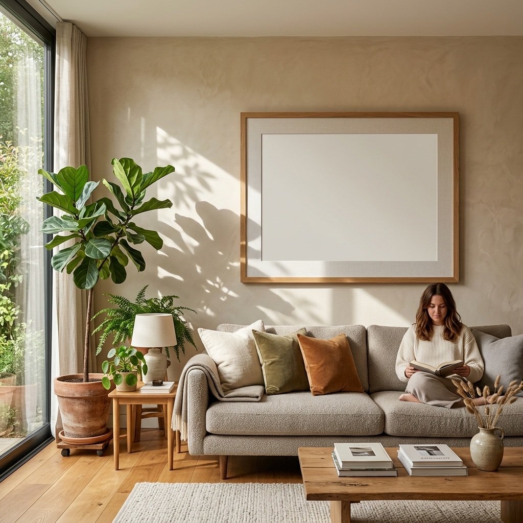
A practical listing-image sequence
Not every product needs the maximum number of images. It does need a sequence with distinct purposes. This eight-frame structure is a useful starting point for physical wall art.
Hero lifestyle image
Show the strongest room scene with the artwork large, clear, and styled for the target buyer. Avoid badges and dense text unless they communicate something essential.
Clean artwork view
Show the design with minimal environmental distraction. This lets the buyer evaluate color, line work, and composition.
Second lifestyle context
Use a different scale or room type—not merely a different crop of the first scene. For example, pair an over-sofa view with a smaller desk or reading-nook view.
Scale and size guide
Compare available dimensions using a clear diagram or a consistent room reference. Label the displayed mockup size so the scene does not imply that every option is equally large.
Close-up detail
Show texture, paper, ink, frame finish, or a meaningful portion of the design. Use a real sample photo when physical material is part of the promise.
What is included
Clarify framed versus unframed, physical versus digital, orientation, and included quantities. This image prevents avoidable misunderstandings.
Production and shipping note
Briefly explain that the item is made to order, who fulfills it, and what the buyer should expect. Keep detailed policies in the listing text.
Coordinating products or set
If relevant, show companion pieces together. A useful cross-sell should help the buyer complete a room, not distract them from the current product.
Selling a digital download? Replace material and shipping images with file ratios, printable sizes, file formats, and a clear “digital item—no physical product” notice. The mockup can inspire; the information images must clarify.
Make the scene believable
Shoppers may not describe a perspective error, but they feel it. A frame that floats above the wall or ignores the room’s lighting makes the product look less trustworthy.
| Element | What to check | Why it matters |
|---|---|---|
| Perspective | Frame edges follow the room’s vanishing lines. | The print feels attached to the scene rather than pasted on top. |
| Light direction | Highlights and shadows agree with windows and lamps. | Conflicting light is one of the quickest signs of a composite. |
| Surface texture | The art respects glass glare, paper texture, or frame depth. | A perfectly flat insert can look synthetic even in a beautiful room. |
| Scale | Frame dimensions are plausible beside sofas, beds, and desks. | Misleading scale leads to disappointed customers. |
| Color | All images use a consistent color profile and restrained grading. | The artwork should not change hue from one mockup to the next. |
If you have access to a physical sample, include at least one real photograph. A generated room can provide style and variety; a sample photo provides evidence about paper, frame construction, and print behavior that a digital mockup cannot.
Common mockup mistakes
- The room is more memorable than the art. Beautiful decor is useful only when it frames the product.
- Every image uses the same composition. Repetition consumes carousel space without answering a new question.
- The artwork is shown larger than the product offered. Always label the represented size when scale could be misunderstood.
- Text covers the artwork. Keep information slides separate from the strongest visual presentations.
- Different mockups shift the artwork’s colors. Buyers should not have to guess which version is accurate.
- Generic watermarks dominate the image. Etsy’s own guidance on protecting listing images recommends incorporating recognizable branding rather than relying on intrusive overlays.
Measure whether the new mockups helped
Do not judge a mockup only by whether you like it at full size. Watch how buyer behavior changes after enough comparable traffic has accumulated.
Change one important variable at a time. If you replace the hero, rewrite the title, change the price, and start advertising on the same day, you will not know what caused the result. For a small shop, qualitative evidence matters too: repeated messages such as “Is the frame included?” point directly to a missing information image.
The storefront is only one layer of the operation. The wall art staging workflow explains how to keep the mockup, production file, and listing draft aligned.
Frequently asked questions
Should the first image be a mockup or the artwork alone?
For wall art, a strong lifestyle mockup often communicates value and use better. Test a clean artwork view when the room makes the design too small or when intricate detail is the main selling point.
How many room mockups should I include?
Usually two or three distinct contexts are enough. Use the remaining images for scale, detail, what is included, and product information.
Can I use AI-generated interiors?
They can be useful as presentation assets if the scene is plausible and the product representation remains honest. Inspect hands, furniture geometry, frame perspective, and lighting carefully, and never use a generated scene as evidence of physical material quality.
Should every listing use the same mockups?
A consistent visual system helps the shop feel coherent, but identical scenes can make products blur together. Keep common typography and information slides while varying the hero context to fit each collection.
Do higher-resolution mockups always convert better?
Resolution prevents softness, but clarity of composition matters more once the file is sufficiently sharp. A simple, readable 2,000-pixel image can outperform a cluttered 6,000-pixel one.
Build a consistent mockup set while you stage the product
Synclisto keeps artwork ratios, wall art mockups, and your Etsy draft in the same workflow so the storefront reflects the production file you reviewed.
Explore free wall art mockups